Member-only story
Tom Organic’s Brilliant Packaging Design
How an Australian feminine hygiene products manufacturer revolutionizes female-targeted packaging.

Tom Organic is an Australian feminine hygiene products manufacturer with the focus on organic and sustainable products. They only use organic cotton for their product line, which includes period underwear, tampons, and maternity pads. The company is committed to transparency, manufactures in the EU, and uses recyclable packaging with natural inks. Their modern, ecological, thoughtful, and unconventional approach to an important part of female-targeted products is reflected in their packaging design.
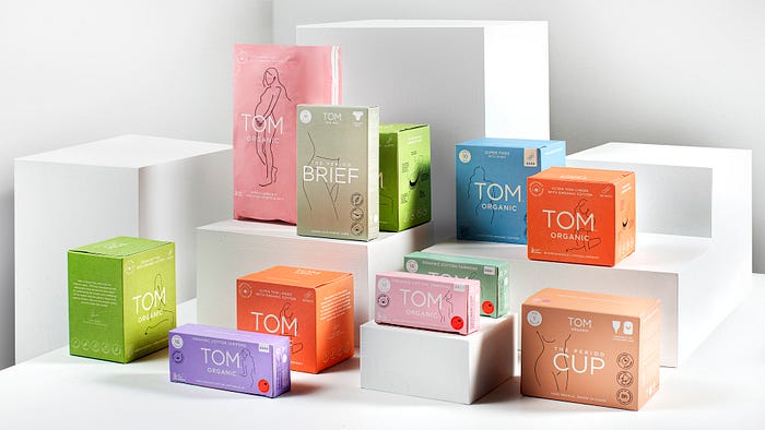
Every product box has a unique, single-tone color that ranges from colorful to pastel. Prominently, in the center of the front side is the company’s logo or the product’s name. Behind it is a simplistic outline-illustration of a naked woman in different poses. The product information is provided in an unobtrusive way, making the packaging look calm and simplistic. Key information — like ecological facts — is displayed with text and icons inside circle shapes. Illustrations and minimalistic text further explain the product on the other sides of the box. Underneath the logo and the illustration is further information at a glance, like “Biodegradable • Hypoallergenic.” The slogan “100% organic cotton, nothing else.” highlights Tom Organic’s new approach to women’s health. The matte finish of the recycled cardboard makes it look ecological and sincere, contrary to the often shiny, commercialized look of competitors.
The packaging design of Tom Organic is radically different to the industry average — in a brilliant way. Instead of overly detailed, loud, and commercialized designs, Tom Organic has minimalistic, beautiful packaging. It has a natural and calm approach to a product category that sometimes is still a taboo subject. It highlights femininity, without being stereotypical, condescending, or generalizing. It has a great way of highlighting key information, without destroying the calm general composition. It is a leap into the future of beautiful and meaningful instead of overly complicated and commercialized packaging that so many competitors still lag behind.
